Create Assessment Form
Introduction
Refer also to the article Manage Custom Assessment Forms for additional information about assessment forms and how they are created using the Assetic application itself.
A set of standard pre-defined assessment form definitions have been made available for a variety of asset categories in the article Standard Assessment Forms.
The Assetic Python SDK allows a new Assessment form to be created using a csv file to define the form; refer to the article Create Assessment Form from csv-Assetic Python SDK.
NOTE Setting parent-child relationships between combobox items needs to take place once the form has been created. Setting these relationships is outlined in the Knowledge Base article Update Assessment Form
API Payload
The Assetic REST API POST /api/v2/assessmentform is used to create an assessment form.
The payload for this API is comprised of a basic definition of the form, plus definitions for each control on the form. Depending on the type of control the payload properties will vary.
Basic Form Definition
The following properties are used to define the form:
| Property | Description | Sample |
| ApplicableLevelName | What Assetic module/level is the form for | One of: "Asset", "GroupAsset", "ComplexAsset","Component", "ComponentServiceCriteria", "NetworkEntity", "SimpleAsset", "WorkOrder", "WorkRequest", "WorkTask","AssesmentsResult", "Documents", "AsmtProject", "AsmtTask", "ServiceCriteria" |
| Label | The user friendly name of the form | KB Sample |
| Name | The name of the form, remove spaces and special characters | KBSample |
| Version | A version number to assign. Integer value. | 1 |
| CanAddAttachment | Set whether documents be attached to form results. Boolean true or false | true |
| FormTabs | An array of tab controls to add to the form. It is recommended that only 1 tab is added to a form becuase the Assetic form builder UI does not support editing multiple tabs | See "FormTabs" section below |
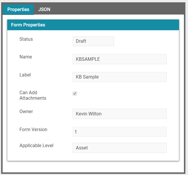
The screenshot below illustrates these settings in the Assetic Form Editor.
- "Owner" is the login used by the API to create the form
- "Status" is always "Draft" when the form is first created by the API.
Form Tab
Define a tab control within the form.
The following properties are used to define the tab control:
| Property | Description | Sample |
| Label | A user friendly label for the form tab | "Tab Label" |
| Visible | Is the tab visible, this a a boolean value that should be set to True | true |
| FormLayout | The layout definition for the tab | See FormLayout section below |
FormLayout
Define the layout within the form.
The following properties are used to define the layout:
| Property | Description | Sample |
| Name | A unique name for the layout. Must not start with a number | L35ab3df0-72b4-11e8-9470-3c15c2bb918f |
| Label | A label for the form. This is not actually visible on the form | layoutTab Label |
| FormLayoutPattern | The pattern for the layout | See FormLayoutPattern section below |
| Widgets | An array of widget definitions. There is one widget per 'cell' as per the number of rows and columns defined by the FormLayoutPattern. | See Widgets section below |
FormLayoutPattern
Define the layout pattern within the form. The following layouts are available.
The number corresponds to the layout "Id"
1. Single
2. column: 2 equal columns
3. 3 equal columns
4. column: 8 Left, 4 Right
5. column: 4 Left, 8 Right
6. column: 4 equal columns
7. Row: Row 1 (1 column),Row 2 (2 equal columns)
8. Row: Row 1 (1 column),Row 2 (3 equal columns)
9. Row: Row 1 (1 column),Row 2 (8 Left, 4 Right)
10. Row: Row 1 (1 column),Row 2 (4 Left, 8 Right)
11. Row: Row 1 (1 column),Row 2 (4 equal columns)
12. Row: Row 1 (2 equal columns),Row 2 (1 column)
13. Row: Row 1 (3 equal columns),Row 2 (1 column)
14. Row: Row 1 (8 Left, 4 Right),Row 2 (1 column)
15. Row: Row 1 (4 Left, 8 Right),Row 2 (1 column)
16. Row: Row 1 (4 equal columns),Row 2 (1 column)
17. Row: Row 1 (1 column), Row 2 (2 equal columns),Row 3 (1 column)
18. Row: Row 1 (1 column), Row 2 (3 equal columns),Row 3 (1 column)
19. Row: Row 1 (1 column), Row 2 (8 Left, 4 Right),Row 3 (1 column)
20. Row: Row 1 (1 column), Row 2 (4 Left, 8 Right),Row 3 (1 column)
21. Row: Row 1 (1 column), Row 2 (4 equal columns),Row 3 (1 column)
22. Row: Row 1 (4 equal columns), Row 2 (2 equal columns)
23. Row: Row 1 (4 equal columns), Row 2 (4 equal columns)
24. Row: Row 1 (3 equal columns), Row 2 (2 equal columns)
25. Row: Row 1 (1 equal col), Row 2 (2 equal col),Row 3 (1 equal col), Row 4 (2 equal col)
The following properties are used to define the layout:
| Property | Description | Sample |
| Id | An integer representing the layout pattern | 2 |
Widgets
Define each widget within the tab layout.
The following properties are used to define the widgets:
| Property | Description | Sample |
| Name | A unique name for the widget. Must not start with a number | W35ab657e-72b4-11e8-892d-3c15c2bb918f |
| Label | The user friendly label for the form control group within the widget | Facility Detail |
| SortOrder | The order the widget appears in the layout. Integer | 1 |
| LayoutContainer | An incrementing container ID starting at zero for the first widget and incrementing by 1 for each subsequent widget | 0 |
| Collapsed | Is the widget expanded or collapsed when the form is first loaded. Boolean | false |
| ViewName | Type of widget view. Use "FormControlGroup" | FormControlGroup |
| TypeName | Type of widget. Use "User" | User |
| View | Internal name for view type. use "Dashboard Partials/_FormControlGroup" | Dashboard Partials/_FormControlGroup |
| FormControlGroup | Defines the controls to add to the widget | See FormControlGroup section below |
FormControlGroup
Groups an array of controls.
The following properties are used to define the Form Control Group:
| Property | Description | Sample |
| Name | A unique name for the group. Must not start with a number | FCG35ab657f-72b4-11e8-a7cf-3c15c2bb918f |
| Label | This label is not visible in the application | FCGFacility Detail |
| Visible | Is the group visible. Set as boolean true | true |
| AreaIcon | An icon for the group. Use "fa-check-square-o" | fa-check-square-o |
| FormControls | An array with the control definitions | See FormControls section below |
FormControls
Defines a form control.
All form controls regardless of type have the following properties:
| Property | Description | Sample |
| Name | A unique name for the control. Must not start with a number | C35abb32872b411e89ea33c15c2bb918f |
| Label | The user friendly label for the control | "Operating Facility" |
| Visible | Is the control visible. Set as boolean true | true |
| HelpString | A 'mouse-over' hint tooltip to assist the user with understand what the control represents | "Enter name of operating facility" |
| Required | Indicates the field is mandatory, and when viewing the form an asterisk will appear beside the label. Boolean true or false | true |
| SortOrder | The order the control appears in the widget. Incrementing integer from 1 | 1 |
| TypeName | The type of control | One of: "Textbox", "UdfCombobox", "NumericTextBox", "TextArea", "Checkbox", "DatePicker", "Timespan", "Map" See control types list below |
Control Types
Textbox
A standard single line text box with the following additional properties:
| Property | Description | Sample |
| DataType | Type of data for the control. Use "string" | string |
| Text Length | Maximum length of the field | 100 |
UdfCombobox
A standard single line text box with the following additional properties:
| Property | Description | Sample |
| DataType | Type of data for the control. Use "string" | string |
| ComboboxItems | The items to appear in the combobox |
ComboboxItems have the following properties:
| Property | Description | Sample |
| SortOrder | Type of data for the control. Use "string" | string |
| Label | The label presented to the user in the combobox | Type A |
| Value | The value represented by the label | 1 |
NumericTextBox
A numeric textbox with arrows for incrementing the number in the box. It has the following additional properties:
| Property | Description | Sample |
| DataType | Type of data for the control. Use "decimal" | decimal |
| NumericMin | Minimum numeric value that can be entered | 0 |
| NumericMax | Maximum numeric value that can be entered | 100 |
| NumericStep | The amount to increment the number by when using the up/down arrows in the textbox | 1 |
| NumericMask | Define the number of decimal places. "n0"=zero decimal places (integer), "n2"=2 decimal places. | n0 |
TextArea
A textbox for text that may span multiple lines. Use where there is a large amount of text. It has the following additional properties:
| Property | Description | Sample |
| DataType | Type of data for the control. Use "string" | string |
| Text Length | Maximum length of the field | 1000 |
Checkbox
A True/False style tick box. It has the following additional properties:
| Property | Description | Sample |
| DataType | Type of data for the control. Use "bool" | bool |
DatePicker
A datetime field that allows date to be selected by a calendar popup.
It has the following additional properties:
| Property | Description | Sample |
| DataType | Type of data for the control. Use "DateTime" | DateTime |
Timespan
A datetime field that allows date to be selected by a calendar popup and time to be selected by a time dropdown. It has the following additional properties:
| Property | Description | Sample |
| DataType | Type of data for the control. Use "DateTime" | DateTime |
Map
A map window. It has the following additional properties:
| Property | Description | Sample |
| DataType | Type of data for the control. Use "geography" | geography |
Complete Payload Sample
The following sample payload is the complete payload required to create an assessment form. It is comprised of the samples from above. This payload can be used without modification to test in your environment.
{
    "Data": [
        {
            "Id": "df36dd4f-3220-446b-8b4c-461df4fed17f",
            "ProjectId": "PROJ123456",
            "Name": "Assessment Project 2023 - Minor Roads",
            "ProjectType": {
                "Id": 1,
                "Name": null,
                "Label": null,
                "_links": [],
                "_embedded": null
            },
            "StartDate": "2023-01-01T00:00:00",
            "EndDate": "2023-01-31T23:59:99",
            "LastModified": "0001-01-01T11:00:00",
            "ProjectManager": {
                "Id": "1a0497f6-31dd-e611-946c-06edd62954d7",
                "DisplayName": null,
                "_links": [],
                "_embedded": null
            },
            "Status": 300,
            "Comments": "This is a project for the 2023 routine inspection of minor roads.",
            "Priority": 0,
            "TaskCount": 0,
            "_links": [],
            "_embedded": null
        }
    ],
    "Total": 1
}